Power BI Essentials: Build & Share a Dashboard for COVID-19

Why take this course?
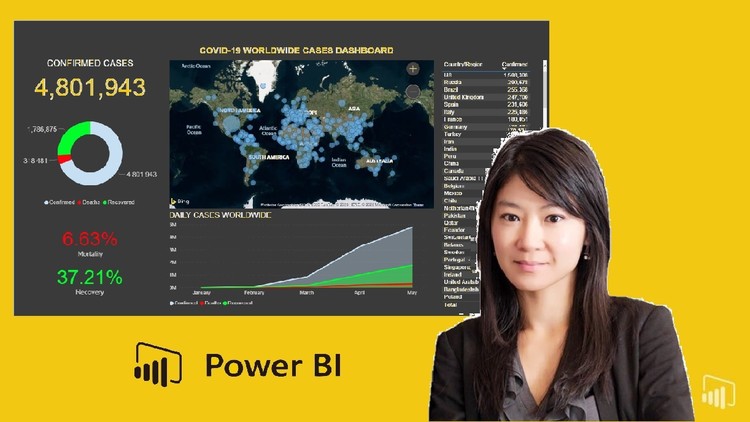
📊 Power BI Essentials: Build & Share a Dashboard for COVID-19 🦠
Course Headline: You get 2 in 1 - Learn the fundamentals of Power BI Desktop and build / publish a COVID-19 dashboard using live data!
-
🧐 Best Practices for Building an Engaging Dashboard: Discover how to create a dashboard that not only presents data clearly but also engages your audience and tells a compelling story.
-
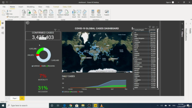
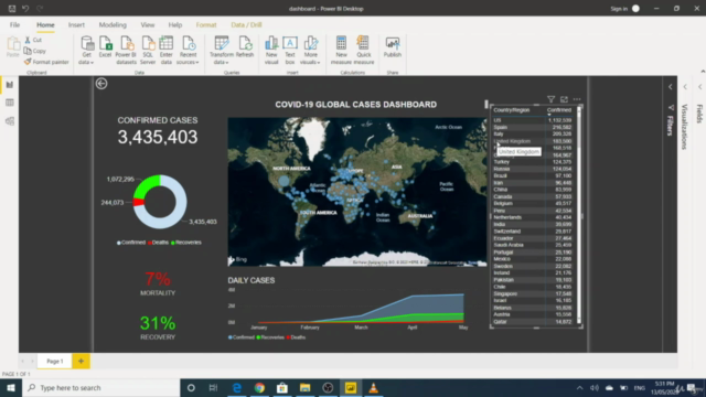
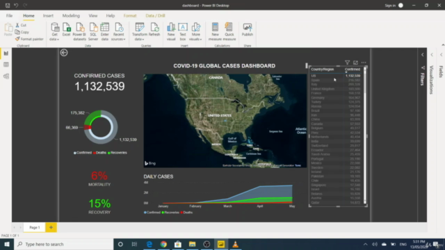
🚀 Create a Professionally Designed Interactive Dashboard in Power BI: Utilize COVID-19 as a real-world scenario to build a dynamic, interactive dashboard that can help inform decision-making processes during critical times.
-
🌍 Connect Power BI to Live Data on the Web: Learn how to source live data from various websites and integrate it seamlessly into your dashboard for up-to-date insights.
-
📈 Build Visualisation Charts: Master the art of creating a variety of visualization charts that can help you make sense of large datasets, including line, bar, scatter, and pie charts.
-
⚛️ Format Your Dashboard: Understand how to use formatting options within Power BI to ensure your dashboard is visually appealing and easy to navigate.
-
🔍 Perform Calculated Measures in Power BI: Gain the ability to perform complex calculations using DAX (Data Analysis Expressions) to uncover deeper insights from your data.
-
🤝 Share Your Dashboard Online with the Public: Explore ways to share and publish your dashboard, making it accessible for peers, stakeholders, or the public to view and analyze.
By the end of this course, you'll not only have a solid understanding of Power BI Desktop but also be able to apply your skills to real-world scenarios, such as visualizing the spread of COVID-19 with accurate and insightful data dashboards. Join us on this journey to become a power user of Power BI and make an impact with your data storytelling! 🚀
Course Gallery


Loading charts...