Panel and hvPlot: A high-level Data Visualization for Python
Simplify Visualization and Interactive Dashboards with Super Easy and Flexible Holoviz tools including Panel and hvPlot
4.93 (83 reviews)

322
students
13 hours
content
Jan 2025
last update
$84.99
regular price
What you will learn
Understand the key concepts of data visualization and its significance in analyzing and communicating data effectively.
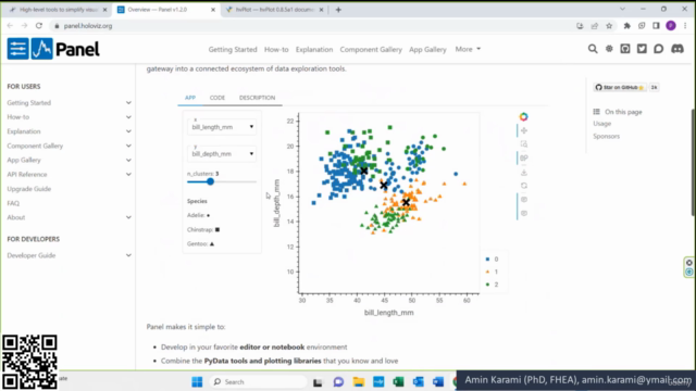
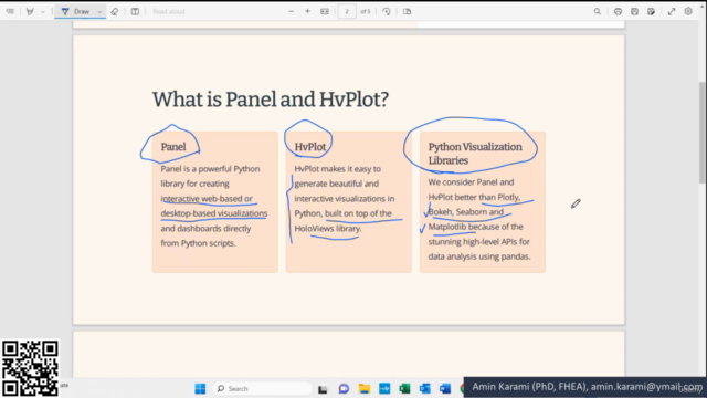
Develop proficiency in using Panel and hvPlot libraries to create interactive and visually appealing data visualizations.
Explore the advanced features and customization options of Panel for building interactive dashboards.
Apply data visualization techniques to real-world datasets and gain insights from data.
Learn best practices for designing visually appealing and impactful data visualizations.
Gain practical experience in creating end-to-end data visualization projects using Panel and hvPlot.
Course Gallery


Loading charts...
Comidoc Review
Our Verdict
While there's room for improvement in hands-on exercises and data manipulation, this Panel and hvPlot course truly excels in enabling learners to create interactive dashboards and visually appealing visualizations. Delivering a 4.92 global rating from 310 subscribers, it proves itself as one of the top-tier resources for expanding your Python data visualization skillset.
What We Liked
- Comprehensive coverage of Panel and hvPlot, perfect for both beginners and experienced Python users looking to enhance data visualization skills.
- Interactive dashboard creation using Panel, enabling ease in data exploration and analysis.
- hvPlot's powerful capabilities to create dynamic visualizations with a wide range of chart types and customizations.
- Guidance on integrating Panel and hvPlot into existing Python workflows, ensuring compatibility with popular libraries.
Potential Drawbacks
- Limited focus on data manipulation and analysis; additional knowledge in this area may be required for optimal results.
- Lacks substantial hands-on exercises or projects to reinforce concepts and apply newly acquired skills.
- Minor inconsistencies in pacing across the course can occasionally make learning challenging.
- Customization and styling techniques could benefit from more in-depth exploration and real-world examples.
4633466
udemy ID
08/04/2022
course created date
27/01/2024
course indexed date
Bot
course submited by