Data Visualization: Best Secrets for Impressive Excel Charts

Use our best secrets, practical guides to build your excel charts and graphs for better data visualization.
4.92 (6 reviews)
Udemy
platform
English
language
Data Science
category
Data Visualization: Best Secrets for Impressive Excel Charts
227
students
3 hours
content
Feb 2025
last update
$13.99
regular price

What you will learn

Learn how-to make eye-catching Excel charts and better visualization through advanced customization techniques like adding titles, axes, data labels

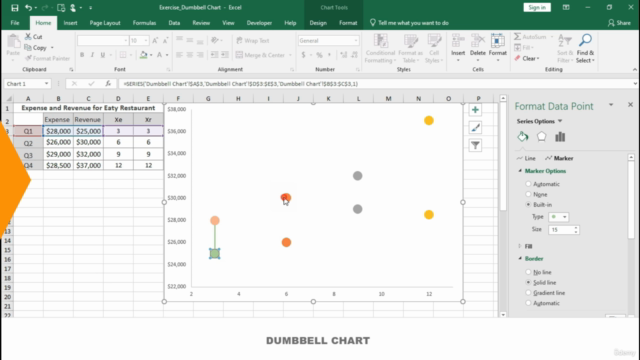
Build 22+ Excel real-world projects from scratch to help you become a data viz rockstar.

Master powerful practical tips and tools to better communicate and concise message through your Excel charts

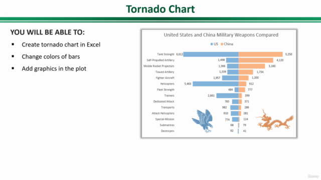
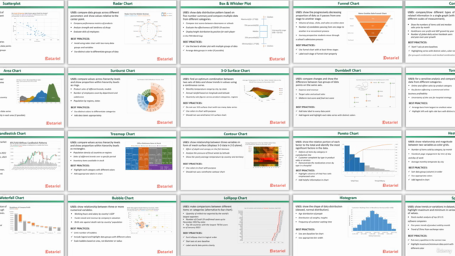
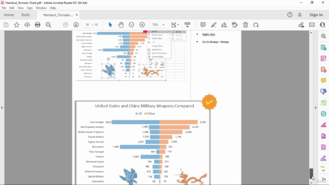
Understand of USES and BEST PRACTICES of 22+ charts in Excel 2019+ (or Microsoft 365)

Course Gallery

Data Visualization: Best Secrets for Impressive Excel Charts – Screenshot 1
Screenshot 1Data Visualization: Best Secrets for Impressive Excel Charts
Data Visualization: Best Secrets for Impressive Excel Charts – Screenshot 2
Screenshot 2Data Visualization: Best Secrets for Impressive Excel Charts
Data Visualization: Best Secrets for Impressive Excel Charts – Screenshot 3
Screenshot 3Data Visualization: Best Secrets for Impressive Excel Charts
Data Visualization: Best Secrets for Impressive Excel Charts – Screenshot 4
Screenshot 4Data Visualization: Best Secrets for Impressive Excel Charts

Charts

Students
11/2212/2201/2302/2303/2304/2306/2307/2308/2310/2311/2312/2302/2403/2404/2405/2407/2408/2409/2411/2412/2402/2503/2505/25060120180240
Price
Rating & Reviews
Enrollment Distribution

Related Topics

4911294
udemy ID
03/10/2022
course created date
18/11/2022
course indexed date
Bot
course submited by
Data Visualization: Best Secrets for Impressive Excel Charts - | Comidoc