Excel Interactive Dashboards and Data Analysis

Why take this course?
🌟 Excel Interactive Dashboards and Data Analysis Course 🌟
Course Headline:
Unlock the Power of Data with Excel! 🚀
Course Title:
"Excel Interactive Dashboards and Data Analysis" with Ian Littlejohn
Course Description:
Course Benefits:
- Learn at Your Own Pace: Lifetime access to course materials and practice activities means you can learn when it suits you best.
- Practical Skills: Gain hands-on experience with real-world data analysis scenarios.
- Versatile Applications: Apply your newfound skills across various sectors, including Sales, HR, Finance, and beyond.
- Future-Proof Knowledge: Stay ahead of the curve by learning the latest tools and techniques in data analysis with Excel.
Course Outcomes:
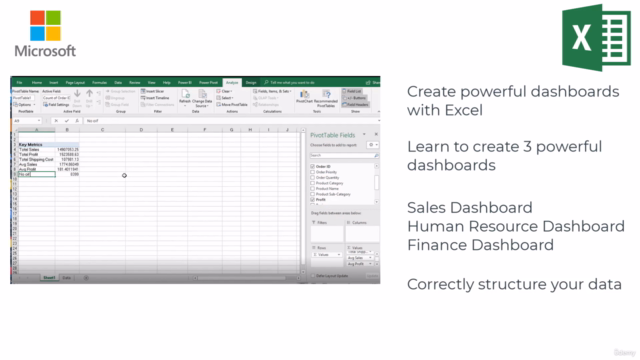
By the end of this course, you'll be equipped to structure and analyze your data like a pro, creating interactive dashboards that can help make informed decisions for any business or personal project. 📈💼
Enroll now and embark on a journey to become an Excel data analysis expert! 🚀📚
Course Gallery


Loading charts...
Comidoc Review
Our Verdict
The 'Excel Interactive Dashboards and Data Analysis' course offers valuable insights, particularly for those looking to harness PivotTable capabilities. The instructor's clear and simple delivery style ensures an engaging experience while working through examples. However, be prepared for occasional excessive detail and minor discrepancies between activity descriptions and their respective solutions. Additionally, this Udemy course reveals some lesser-known features of Excel dashboards but falls short when compared to Power BI's visualization capabilities.
What We Liked
- Comprehensive training on leveraging the power of PivotTables, data modeling, and building clear dynamic dashboards
- Instructor explains concepts in a simple and understandable manner with real-world examples
- Course provides a logical progression from basics to advanced techniques in creating interactive Excel dashboards
- Content is concise and clear, making it easy for learners to follow along while manipulating training data
Potential Drawbacks
- In some parts, the instruction goes into great detail which may be unnecessary for certain users
- Occasionally, minor discrepancies between practical activity descriptions and solution videos
- Limitation of visualization possibilities due to Excel's built-in constraints compare to Power BI
- A very basic understanding of Excel is recommended; otherwise, the course may feel overwhelming