Design Data Visualizations & Dashboards For Insight & Action

Why take this course?
🎉 Design Data Visualizations & Dashboards For Insight & Action 📊
Course Headline: 5 Steps to Design Dashboards Before Building in Business Intelligence Tools like Tableau, Power BI, MicroStrategy, Excel
About the Course:
🚀 Introduction: Dashboards are the superheroes of data communication, offering a glimpse into your business's health at a mere glance. They can track Key Performance Indicators (KPIs), monitor performance, and guide decision-making processes. However, the success of a dashboard isn't just about choosing the right Business Intelligence (BI) tool; it's about designing a dashboard that resonates with your audience and offers them actionable insights.
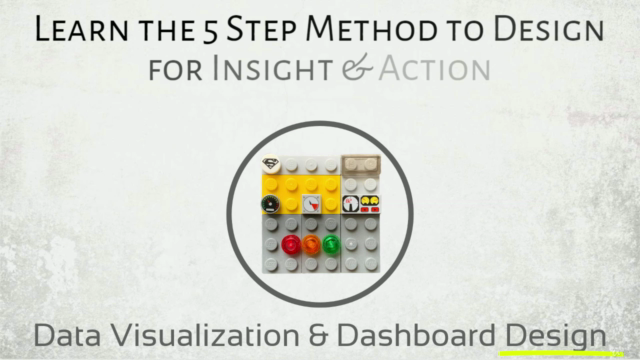
Too often, dashboards are built without considering the user experience, leading to low adoption rates. This is where our 5-step data visualization and dashboard design method come into play, ensuring your dashboards not only look good but also serve a purpose and drive action!
Your Instructor: Lyndon Cerejio, a seasoned course instructor with over a decade of experience working with Fortune 500 clients, has mastered the art of designing impactful dashboards and data visualizations across various BI tools like Tableau, Power BI, MicroStrategy, and even MS Excel and PowerPoint.
Course Breakdown:
🎓 Learning Outcomes:
- Understand User Needs: Identify different user roles and their specific data requirements.
- Metrics Evaluation: Determine the most relevant metrics and KPIs for your dashboard.
- Visualization Ideation: Explore various visualization options to effectively represent your data.
- Prototype Creation: Develop a low-fidelity prototype of your dashboard to test your ideas.
- Validation & Iteration: Validate your designs with real users and refine your dashboards for optimal performance.
Course Structure:
-
Identify User Roles & Needs 🎭
- Understanding who your dashboard is for and what they need to see.
-
Evaluate Metrics & KPIs 📈
- Selecting the most impactful metrics that align with your business objectives.
-
Ideate Visualization 🎨
- Brainstorming how to best present your data to users for clarity and impact.
-
Create Prototype 🖼️
- Building a basic version of your dashboard to visualize your ideas.
-
Validate & Iterate 🔄
- Gathering feedback from actual users and refining your dashboard accordingly.
Why Take This Course?
🔍 Target Audience: This course is perfect for anyone involved in data analysis, project management, design, or development who wants to create more effective dashboards and data visualizations. Whether you're an analyst, a project manager, or a designer, these 5 steps will guide you through the process of designing dashboards that are not only beautiful but also insightful and actionable.
Key Takeaways:
- A user-centered design approach to dashboard creation.
- Strategies to select and present KPIs effectively.
- Techniques for ideating and implementing visualizations.
- Prototyping skills to test your designs before development.
- User validation methods to ensure your dashboards meet the mark.
Enroll Now to Transform Your Data into Actionable Insights! 🚀📊
Join Lyndon Cerejio and learn how to design data visualizations & dashboards that make a real difference in your decision-making processes. Don't let your data go untapped - turn it into action with our 5-step method, no matter which BI tool you prefer!
Course Gallery
Loading charts...