Data Visualization in Stata

Why take this course?
📈 Unlock the Power of Data Visualization with Stata!
Course Headline:
Data Visualization in Stata: Mastering Advanced Graphing Techniques
Course Description:
Are you ready to transform your data into compelling visual stories? With our Data Visualization in Stata course, you'll gain the skills to do just that! This course is tailored for learners who are eager to understand and apply various visual techniques without getting bogged down by complex equations or statistics.
Why Take This Course?
- User-Friendly Learning: Dive into the world of data visualization with a step-by-step approach that's easy to follow, no matter your experience level.
- Modular Design: Choose the graphs that interest you most and learn at your own pace. Skip ahead or revisit topics as needed.
- Practical Application: Learn by doing! This course focuses on practical application in Stata, a powerful statistical software package.
Course Highlights:
- Understand the principles behind common data visualization methods.
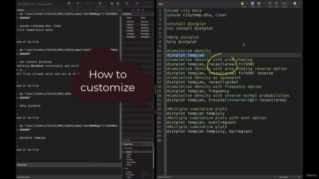
- Discover how to code these methods in Stata, enabling you to create customized and meaningful visualizations.
- Explore various visualization techniques and select the best ones for your data message.
Key Learning Outcomes:
- Learn and understand the basic methods of data visualization.
- Master variations and customizations of these fundamental visualization methods.
- Gain experience with different visualization techniques and apply them effectively.
- Code numerous Stata graphs from scratch.
- Modify, create, and tailor bespoke data visualizations to suit your needs.
🌱 Before You Begin: For beginners, we recommend completing the "Essential Guide To Stata" course first to familiarize yourself with the basics of Stata's environment and .do files. This course builds upon that foundation.
Course Themes:
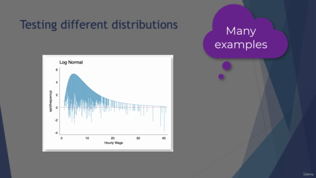
- Histograms & Density Plots
- Spike Plots and Rootograms
- Box and Whisker Plots, including Violin Plots
- Stem-and-Leaf, Quantile, and Table Plots
- Bar Graphs, Pie Charts, and Dot Charts
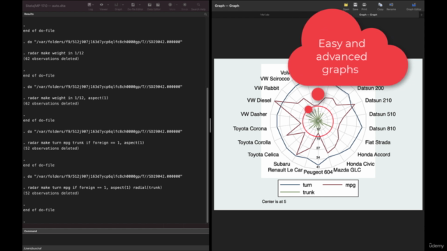
- Radar and Scatter Plots, including Heat and Hex Plots
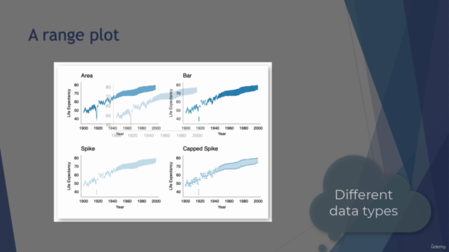
- Sunflower, Lines of Best Fit, Area, Line, Range, Rainbow, and Jitter Plots
- Baloon, Mosaic, Chernoff Faces, Sparkling, and Bubble Plots
- And many more!
By the end of this course, you'll be equipped with a diverse range of visualization techniques to analyze, interpret, and present your data effectively in Stata. Whether you're a seasoned data scientist or just starting out, this course will enhance your ability to communicate complex information through clear and impactful visualizations.
Remember to follow us on Twitter for monthly promo codes and updates: @easystats3 🐦
Enroll now and step into a new realm of data visualization with Stata! Let's make your data not just understood, but seen.
Course Gallery


Loading charts...