Data Storytelling with Power BI
Become a master data visualizer
4.06 (31 reviews)

167
students
4 hours
content
Mar 2022
last update
$19.99
regular price
Why take this course?
📘 Unlock Your Data Storytelling Potential with Power BI!
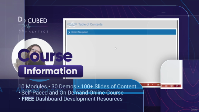
Course Information:
- Total Modules: 10
- Demos Included: 30
- Exclusive Resource: FREE Dashboard Development Kit
- Content Type: Self-Paced & On Demand Online Course
- Slides: Over 100+ of the most informative content!
🎯 Key Topics:
- Guided Analytics Framework: Learn how to structure your analytics for maximum impact.
- Agile Dashboard Methodology: Master the agile approach to dashboard development.
- Self-Serve Dashboards Guide: Build dashboards that empower users at all levels of an organization.
- Dashboard UX/UI Design Best Practices: Create visually appealing and user-friendly dashboards.
- Hierarchy of Granularity: Understand how to design dashboards for different audience needs.
- Consumer-Driven Data Visualization Framework: Tailor your dashboards to the specific needs of your consumers.
- Chart Types Mastery: Learn to create & format over 25+ types of charts in Power BI!
- High-Res Dashboard Layouts with Figma: Design stunning layouts for your reports using Figma.
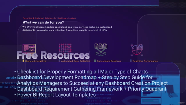
🎓 FREE Resources Included:
- Checklist for Properly Formatting Charts: Ensure consistency and professionalism in all your visualizations.
- Dashboard Development Roadmap & Guide: A step-by-step resource for analytics managers to lead successful dashboard projects.
- Requirement Gathering Framework & Priority Quadrant: Learn how to effectively gather requirements and prioritize them for optimal results.
- Power BI Report Layout Templates: Jumpstart your report design with professionally crafted templates.
About the Instructor:
Ahmad Chamy is a Microsoft Certified Data Analyst & Trainer, CEO and Founder of D Cubed Analytics, and an instructor at the British Columbia Institute of Technology. With over 100 analysts trained from a dozen countries, Ahmad's expertise and experience will guide you through the complexities of data storytelling with Power BI.
Who is this course for?
- BI Developers
- Data Analysts
- Technical Business Analysts
- Analytics Managers & Consultants
- Foundational understanding of building reports in Power BI Desktop required.
Section 1: Consumer-Driven Data Visualization Framework
Learn how to approach dashboard development with a roadmap designed to meet consumer needs. This section sets the foundation for a user-centric design approach.
Sections 2-10:
Bar Charts:
- Learn the 8-point checklist for perfect bar chart formatting every time.
- Explore advanced bar chart types like bullet, paired bar, and deviation charts.
Line & Area Charts:
- Master the 5 essential rules for formatting line and area charts.
- Discover which type of line/area chart is best suited for your data.
Single Value Visualizations:
- Dive into the 4 formatting rules for KPIs.
- Create custom KPI visuals with a 5-step process.
Thematic Maps:
- Understand the importance of mastering the 5 types of maps.
- Captivate your audience with simple and effective mapping visualizations.
Visualization Mistakes to Avoid:
- Learn what types of visualizations can potentially mislead or confuse your audience.
Self-Service Dashboards:
- Conclude the course by understanding how to create dashboards that users can interact with and analyze data independently.
Embark on a journey to become a master in data storytelling with Power BI. Enroll now and transform the way you present and analyze data! 📊✨
Course Gallery


Loading charts...
Related Topics
4504710
udemy ID
20/01/2022
course created date
03/03/2022
course indexed date
Bot
course submited by